
New Calendar View for your Schedules
Our new calendar view makes organising your schedules a breeze!

Dom Barnes
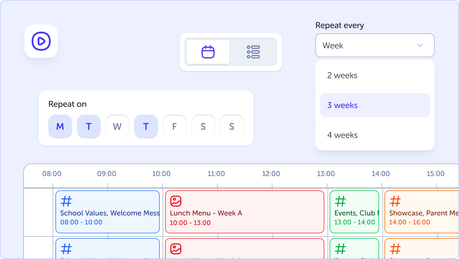
Today we launched Phase 1 of our new TrilbyTV User Experience, which we are calling ‘v6’. Until today, our schedules have been presented in one long chronological list, which is helpful to see everything at a glance, but makes it really difficult to answer the simple question: What should be on my screen right now?
We've long wanted to improve how you create and manage your player schedules and last year we started a journey which began with wanting to add advanced scheduling, and ended up in a long term design update.
The core product had some great new upgrades to it, supporting reccurring events over 2,3 or 4 weeks to allow easy scheduling of repeating clubs or lunch menus, and the addition of colours to schedules helps you easily identify types on schedules; Green for lunch, Yellow for School Messages, or however you wish to organise them.
A calendar view is something many signage products offer, and most of them present you with a week to view column calendar, much like you see in Outlook or Google Calendar. When we came to look at how we design our scheduling, we knew this wasn’t the route we wanted to go. There were a number of issues with the vertical layout we saw:
Horizontal space - using a vertical calendar means you only get a very narrow amount of room for schedule information, leading lots of wrapping text
Overlapping events - In vertical calendars, overlapping events tend to get shown side by side, further exacerbating the horizontal space issue, but not always making it clear what should be showing
Designing for screen sizes - most computers today have widescreens, in fact more than 75% of our web app users are on widescreens. And in education, weekends are much less important for signage at many schools, so why are we using a quarter of the screen for empty days
From the earliest designs, we knew a horizontal calendar made much more sense to us. It makes better use of the users’ browser space, even on narrower screens, you can comfortably view an entire school week without scrolling, and having wide schedule blocks means we have a lot more room for descriptive labels and icons to help identify scheduled content.
We also took the opportunity to free up some screen space, by moving a lot of the configuration options to a new sidebar. You’ll see this a lot in v6 as it rolls out, but moving the less-frequently used options out of the main display gives us even more space for our calendar, making sure the reason you came to the page is as easy as possible to interact with.
This is just the start — you'll see the new sidebar pattern across v6 as it rolls out over the coming months as we roll out v6 to the rest of the product.
Full Changelog
New
Calendar view - see your content plans for the week ahead
Repeating Schedules - create schedules that repeat every 1,2,3 or 4 weeks
Side bar - where you'll also find all your player settings and actions
New
List view - cleaned up layout that shows all your schedule information
